Down App Launch

Industry

Social Media

Client

Down App

Tags

Product Design, Marketing

Time

3 months, 2022

Designing a friend-finding app that brings groups of people together in real life.

Down is a unique friend-finding app that sets itself apart from other social media and friend-finding applications by prioritizing the facilitation of in-person meetups. With Down, no need to wait on your friends if they are unavailable; if you want to engage in activities like playing pickup basketball or attending a concert, you can create a post on our app, fill out event details, and share it on other users' feeds. Interested individuals can then request to join.

The app had a brief launch in September 2022. During that period, my design team (consisting of myself and another designer), was actively involved in a sprint to finalize and launch the product. Our specific tasks involved a website redesign and the creation of marketing design collateral, aiming to effectively communicate Down's value proposition to its target audience of young adults and college students.

45% of 18-25 year olds struggle to always in finding people to do their hobbies with. (1)

61.3% of college students feel severely lonely. (2)

61.3% of college students feel severely lonely. (2)

A survey sent out by the Down team was answered by a total of 437 participants between the ages of 18-25 regarding activities they liked to do and how easy it was for them to find people to do the activities with. In addition to secondary research, the latter two statistics were found.

These stats are understandable considering that people move away from their existing friends following these big changes in life. Down’s goal is to bring about new connections for these target audiences. The app focuses on creating small, intimate group hangouts and bringing people with similar interests together and form genuine friendships.

Goals of Website Redesign

With the app's launch approaching, the design team was tasked with redesigning Down's existing website to serve as a compelling marketing touchpoint—one that could captivate potential users and drive downloads. We identified three core goals:

"Why Down": There should be a clear, compelling case for why users should choose Down over large, established platforms. This website needed to communicate what sets us apart at a glance.

Value Proposition: There is no shortage of friendship and dating apps. Thus, this redesign needed to spotlight Down's unique focus of facilitating small, intimate groups for genuine friendships.

App Adoption: ‍Ultimately, the website needed to convert visitors into users. By extending a compelling invitation, users will download the app and engage with it firsthand.

Pre-design Work

What can we take away from the existing website?

My design team started by taking a look at the existing website design and critiquing it ourselves. We made several notes of areas where user experience and visual designs could be improved, as well as design choices that already seem to work well.

As this website was designed by one of the co-founders, this critique session was also an opportunity for us to thoroughly understand the product vision in accordance with its developers. We took note of the style guide and how we could possibly make visual changes without detracting from its brand.

What are our competitors doing well?

Next, my partner and I took a look at our competitors to see what we liked about their app websites. Some websites that we particularly liked and thought were visually appealing were of the companies e-gree, Lydia, Peanut, and Meetup. We thought they all had a welcoming yet calming portrayal of their missions and were very easy to scroll and read.

What should information architecture look like?

Of course, before diving into the designs, we had to lay out information architecture. We drafted up some outlines of how information will best be presented in reference to the existing website and also new information to be provided. Considering the goals of website in mind, we also wanted to organize headers in a way that would allow the user to be drawn in to certain points we wanted to highlight.
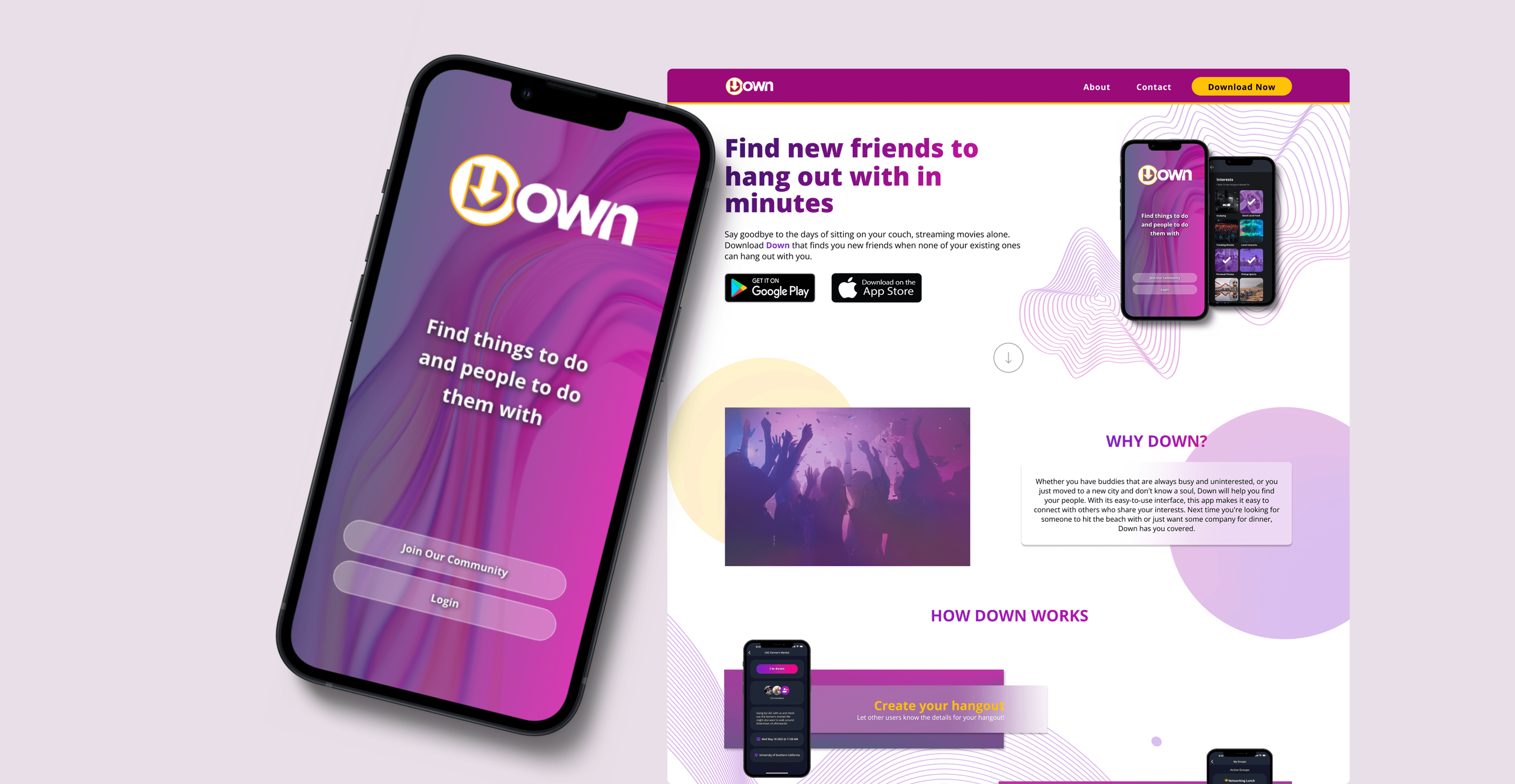
Final Design

Final website design - Gif

Information Hierarchy: For the user experience, we added a testimonial section, which is a trust-building element we noticed across many competitors. We also dedicated most of the homepage to "Why Down" and "How Down Works" to put the app's usability and mission front and center.

Information Hierarchy: For the user experience, we added a testimonial section, which is a trust-building element we noticed across many competitors. We also dedicated most of the homepage to "Why Down" and "How Down Works" to put the app's usability and mission front and center.

Style: We kept the spirit of the original color scheme but shifted toward warmer purples and a brighter yellow. These tones feel more welcoming and energetic, and pairing them with a white background helps the designs and patterns really pop. In addition, we used abstract shapes in the background to add a playful element.

Style: We kept the spirit of the original color scheme but shifted toward warmer purples and a brighter yellow. These tones feel more welcoming and energetic, and pairing them with a white background helps the designs and patterns really pop. In addition, we used abstract shapes in the background to add a playful element.

Final website design

Final FAQ design

Product Education: A FAQ section answers important information the user needs and may want to know about Down, which helps address any last questions before downloading the app.

Post-design Interviews

The design team wanted to get feedback on the new designs to ensure any last-minute design updates that should be added given that the product was to launch soon. Given the time constraints, we were only able to get in touch with three previous survey takers for an informal video chat. We were met with positive responses from the interviewees regarding not only the website redesign, but also support in the product launch!

Overall, the interviewees really liked the color scheme and described the visual layout as engaging and exciting. One participant noted that the buzzwords "hang out" helped differentiate Down from other meet-up applications, as it implied a more casual way of making connections.

However, the excess white space and lack of images were commented on as areas of improvement. Should we get time to go back to redesigning the website, these would be areas of prioritization.

Takeaways

As this was my first experience working for a startup, I found the environment really exciting and loved the passion that the team carried for their product. I also got to spearhead many design initiatives, such as the website redesign. It was a fun opportunity for me to practice my visual skills alongside taking design leadership. I especially enjoyed talking to potential future users of the product, as it gave me a face to those I was designing for and helped me understand their needs and wants better.

As this was my first experience working for a startup, I found the environment really exciting and loved the passion that the team carried for their product. I also got to spearhead many design initiatives, such as the website redesign. It was a fun opportunity for me to practice my visual skills alongside taking design leadership. I especially enjoyed talking to potential future users of the product, as it gave me a face to those I was designing for and helped me understand their needs and wants better.